Graphic design · Type Design · EKA Student Project · 2024/25
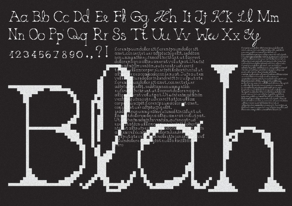
Blahblah is a typeface made in 2024. Its pixelated glyphs and the combination of serif and calligraphic letters sit right on the line between digital and analog. The structure is digital and rigid, but it has kinks and grooves woven in like handwriting would. Some letters feel formal, while others tilt or break. The pixelation pulls from nostalgia and early digital aesthetics while the calligraphic elements ground it and turn it into something more human.
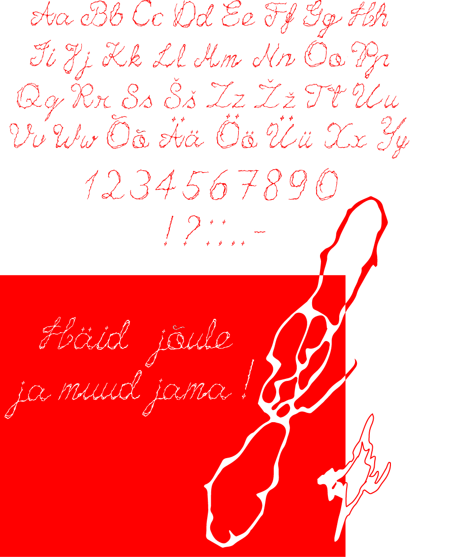
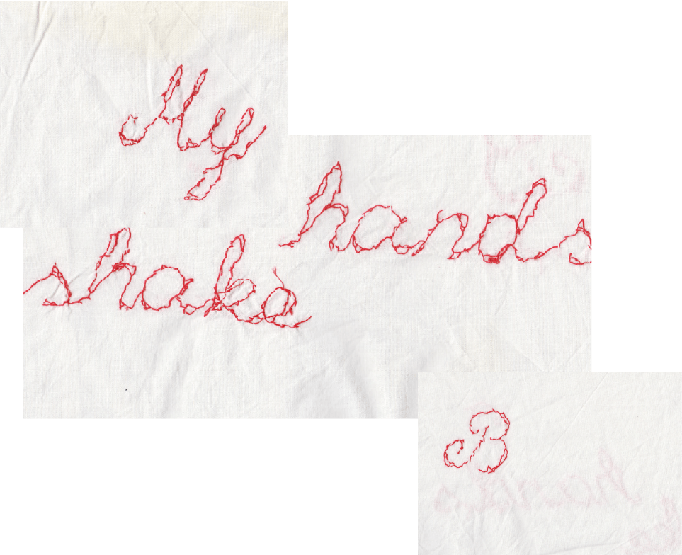
Mistakes came out of our first typography class at EKA, where we were given complete freedom with one requirement: create a typeface. I've always been drawn to calligraphic letterforms, so hand drawn letters seemed like an obvious choice. My hands were shaking, and the letters came out jagged and uneven. Rather than starting over, I chose to lean into the mistake and let it develop the direction of the work. The typeface reflects a broader pattern in my design practice. I begin with a concept, engage with something that interests me, make mistakes, and instead of avoiding them completely I allow them to remain and contribute to the outcome. The trembling lines became structural rather than accidental, and the imperfections shifted into something intentional. The typeface was later traced and sewn into a pillow as a way to capture the delicate but shaky quality of the letterforms.